Anatomy Tree Display
Contents
Version 2
For conference call on 1/22/2010
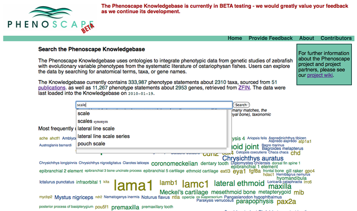
Access anatomy tree summary results from front search page:
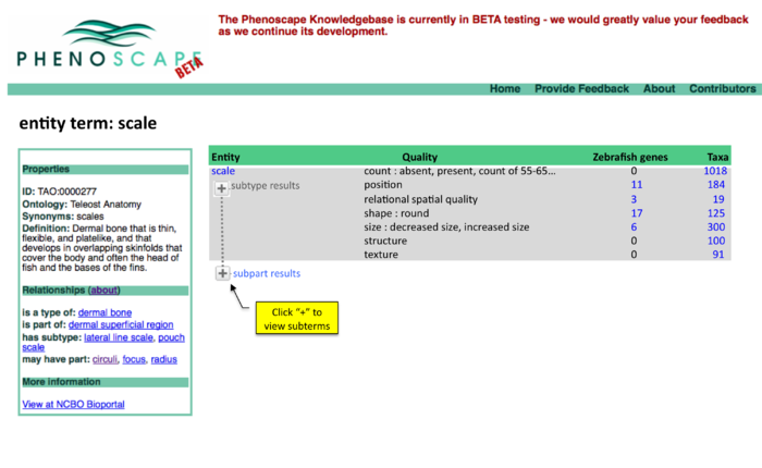
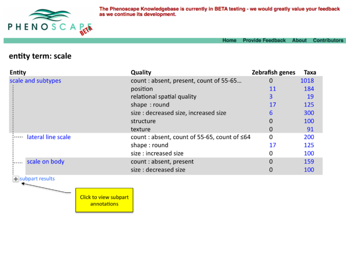
Summary results, page 1
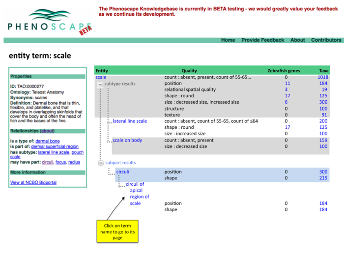
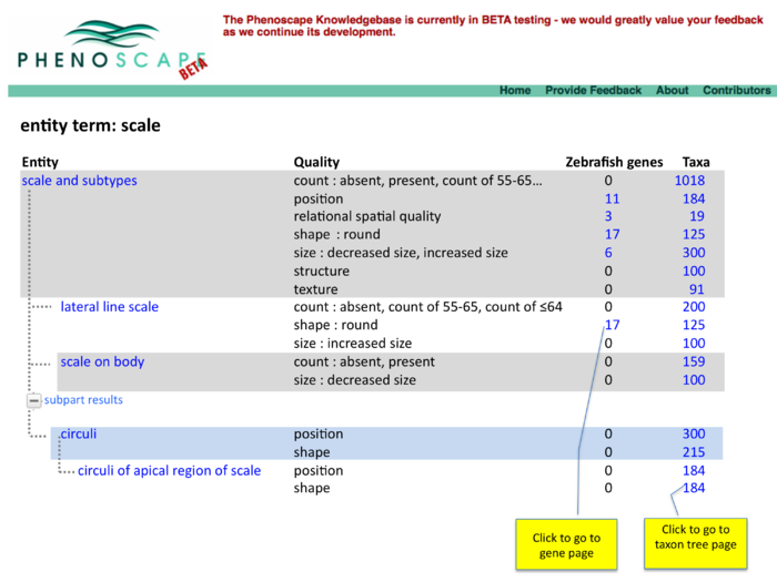
Summary results, page 2
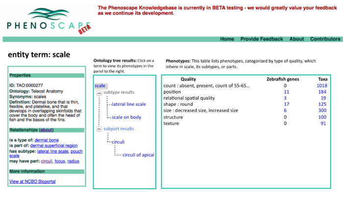
Two panel display of summary results
Version 1
From conference call on 1/21/2010"
Access anatomy tree summary results from front search page:
Summary results, page 1
Comments:
- Alternatively, this could be a two-panel display with tree in the left panel and results table in right panel, similar to BioPortal's layout.
- make mockup for next conf call
- How to clearly indicate relationships on branches? For example, "type of" and "part of" with arrow pointing to parent?
- Don't need to display relationships on branches if tree has "subtype results" and "subpart results" labeled.
- tree is confusing. Would be clearer to indent child terms, similar to OBO-edit's ontology tree viewer.
Summary results, page 2
Version 0
Search summary results
Copied from this page: Knowledgebase_mockups
This would be an enhancement to the Phenotypes results currently displayed on a page like http://kb.phenoscape.org/search/anatomy/TAO:0000376
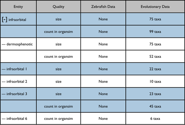
The leftmost column is intended to represent a disclosable tree display. The nearest common ancestor of the represented annotated anatomy terms is used as the root of the tree display. Each anatomy term has a flat list of the qualities annotated for it. Don't pay too much attention to the dummy numbers given in these results.
Root anatomy term "infraorbital" collapsed:
Root anatomy term "infraorbital" expanded:
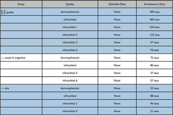
Possible further enhancement to page capabilities - redisplay data on a quality tree. The included results would be somewhat different.
Nearest quality ancestor collapsed:
Quality ancestor expanded:
Comments
- From Paula: Rename 'Entity' 'Anatomy' as per other mockups for consistency http://kb.phenoscape.org/search/anatomy/TAO:0000376
- From Paula: swap column headings Entity-Quality on Quality tree table (below ' Nearest quality ancestor collapsed" text)
- From Todd (cosmetic): I'm not sure the alternating colors will be clear when there are multiple rows - those are most useful as an aid to follow horizontally across many columns within a row
- From Todd: would it be possible to collapse the quality column too (ie to "4 qualities" for a given entity? or "4 anatomical terms" for a given quality)?
- From Todd: Personally I think having the anatomical entity in the 1st column is a lot more useful than having the quality tree there.
